Table of Contents
Container Widget in Flutter
Container widget is the most important widget in Flutter. It contains other widgets and can be of any type of widget. For example, we can add a text widget to it. There are different properties of the container. We can set its margin, padding, width, height, and color as well. It is built in the Material Widget.
Setting margin and padding of container widget in Flutter
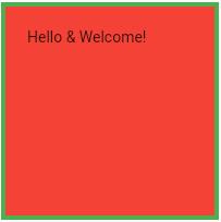
We use EdgeInsets.only to set its margins from left, right, top, and bottom. If we intend to set similar margins from all sides we can also do it by using EdgeInsets.all(value). We can also set Padding which is to set margins for the widget being used in the container. We need to set it the same as margins. Let’s see an example of a container widget with these properties:-
import 'package:flutter/material.dart';
void main() {
  runApp(MyContainerWidget());
}

class MyContainerWidget extends StatelessWidget {
  const MyContainerWidget({super.key});

  @override
  Widget build(BuildContext context) {
    return MaterialApp(
      home: Scaffold(
        appBar: AppBar(
          title: Text("Container Widget"),
        ),
        body: Material(
          child: Container(
            width: 200,
            height: 200,
            child: Text("Hello & Welcome!"),
            margin: EdgeInsets.all(20),
            padding: EdgeInsets.all(20),
            decoration: BoxDecoration(
                color: Colors.red,
                shape: BoxShape.rectangle,
                border: Border.all(width: 4,style:BorderStyle.solid,color: Colors.green)
            ),
          ),
        ),
      ),
    );
  }
}
Decoration Property for Container widget in Flutter
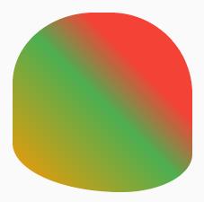
We decorate our container to make it attractive. In decoration property, we use box decoration for this purpose. We can set color with color property and also can change the shape of a container. Another option in colors is of gradient which is done by mixing colors. The border-radius is to curve the sides of a container. We can set it from all four sides and also different each side as well to convert it to any shape. We set it in pixels. Let’s see its example:
import 'package:flutter/material.dart';

void main() {
  runApp(MyContainerWidget());
}

class MyContainerWidget extends StatelessWidget {
  const MyContainerWidget({super.key});

  @override
  Widget build(BuildContext context) {
    return MaterialApp(
      home: Scaffold(
        appBar: AppBar(
          title: Text("Container Widget"),
        ),
        body: Material(
          child: Container(
            width: 200,
            height: 200,
            child: Text("Hello ERozgaar!"),
            margin: EdgeInsets.all(20),
            padding: EdgeInsets.all(20),
            decoration: BoxDecoration(
              color: Colors.red,
              shape: BoxShape.rectangle,
              border: Border(
                top: BorderSide(color: Colors.purpleAccent, width: 10,),
                bottom: BorderSide(color: Colors.green, width: 10),
                left: BorderSide(color: Colors.blueAccent, width: 10),
                right: BorderSide(color: Colors.deepPurple, width: 10),
              ),
              gradient: LinearGradient(
                colors: [Colors.red,Colors.green,Colors.orange],
                begin: Alignment.topRight,
                end: Alignment.bottomLeft,
                stops: [0.3,0.5,1.0],
              ),
              borderRadius: BorderRadius.only(
                topLeft: Radius.elliptical(150, 130),
                topRight: Radius.elliptical(150, 150),
                bottomLeft: Radius.elliptical(200, 90),
                bottomRight: Radius.elliptical(130, 70),
              ),
            ),
          ),
        ),
      ),
    );
  }
}
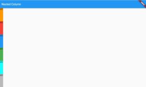
Expanded Widget
An expanded widget is used to equally distribute space. Our previous work was simple but if we want to show our work in the form of rows and columns, we use the expanded widget. We can wrap our rows and columns in an expanded widget to equally divide it as per screen. For example, one column expanded widget code will be as under:-
import 'package:flutter/material.dart';

void main() {
  runApp(NestedColumn());
}

class NestedColumn extends StatelessWidget {
  const NestedColumn({super.key});

  @override
  Widget build(BuildContext context) {
    return MaterialApp(
      home: Scaffold(
        appBar: AppBar(
          title: Text("Nested Column"),
        ),
        body: Material(
          child: Column(
            children: [
              Expanded(
                child: Container(
                  color: Colors.orange,
                  child: Text("ABC"),
                ),
              ),
              Expanded(
                child: Container(
                  color: Colors.red,
                  child: Text("ABC"),
                ),
              ),
              Expanded(
                child: Container(
                  color: Colors.blue,
                  child: Text("ABC"),
                ),
              ),
              Expanded(
                child: Container(
                  color: Colors.green,
                  child: Text("ABC"),
                ),
              ),
              Expanded(
                child: Container(
                  color: Colors.cyanAccent,
                  child: Text("ABC"),
                ),
              ),
              Expanded(
                child: Container(
                  color: Colors.black26,
                  child: Text("ABC"),
                ),
              ),
            ],
          ),
        ),
      ),
    );
  }
}
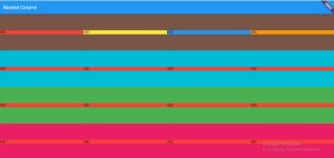
Rows in Columns
We can set rows in columns as well. By using these techniques, we can make full screens with the help of columns and rows. Let’s see an example:-
import 'package:flutter/material.dart';

void main() {
  runApp(NestedColumn());
}

class NestedColumn extends StatelessWidget {
  const NestedColumn({super.key});

  @override
  Widget build(BuildContext context) {
    return MaterialApp(
      home: Scaffold(
        appBar: AppBar(
          title: Text("Nested Column"),
        ),
        body: Material(
            child: Column(
              children: [
                Expanded(
                  child: Container(
                    color: Colors.brown,
                    child: Row(
                      children: [
                        Expanded(child: Container(color: Colors.red, child: Text("ABC"),),),
                        Expanded(child: Container(color: Colors.yellow, child: Text("ABC"),),),
                        Expanded(child: Container(color: Colors.blue, child: Text("ABC"),),),
                        Expanded(child: Container(color: Colors.orange, child: Text("ABC"),),),
                      ],
                    ),
                  ),
                ),
                Expanded(
                  child: Container(
                    color: Colors.cyan,
                    child: Row(
                      children: [
                        Expanded(child: Container(color: Colors.red, child: Text("ABC"),),),
                        Expanded(child: Container(color: Colors.red, child: Text("ABC"),),),
                        Expanded(child: Container(color: Colors.red, child: Text("ABC"),),),
                        Expanded(child: Container(color: Colors.red, child: Text("ABC"),),),
                      ],
                    ),
                  ),
                ),
                Expanded(
                  child: Container(
                    color: Colors.green,
                    child: Row(
                      children: [
                        Expanded(child: Container(color: Colors.red, child: Text("ABC"),),),
                        Expanded(child: Container(color: Colors.red, child: Text("ABC"),),),
                        Expanded(child: Container(color: Colors.red, child: Text("ABC"),),),
                        Expanded(child: Container(color: Colors.red, child: Text("ABC"),),),
                      ],
                    ),
                  ),
                ),
                Expanded(
                  child: Container(
                    color: Colors.pink,
                    child: Row(
                      children: [
                        Expanded(child: Container(color: Colors.red, child: Text("ABC"),),),
                        Expanded(child: Container(color: Colors.red, child: Text("ABC"),),),
                        Expanded(child: Container(color: Colors.red, child: Text("ABC"),),),
                        Expanded(child: Container(color: Colors.red, child: Text("ABC"),),),
                      ],
                    ),
                  ),
                ),
              ],
            )
        ),
      ),
    );
  }
}
Practice makes a man perfect. So practice them in flutlab.io or on Android Studio. Best of luck!!